BlueROCK Consulting
Rebrand & Website Modernization
Led a full B2B consulting modernization, from rebrand and service positioning through a custom WordPress website and CMS, improving clarity, credibility, and content operations for ongoing growth.
Overview
BlueROCK is a technology services consulting firm that needed a refreshed, cohesive market presence, starting with brand identity and extending through web experience and content. The engagement included a complete rebrand (logo, color system, and visual identity), refinement of their business/services positioning through stakeholder engagement, and a rebuilt marketing website designed to support credibility and lead qualification.
I led the work as Product Director + Design Project Manager + UX Lead: planning and sequencing the project, running discovery and stakeholder working sessions, managing approvals, and directing execution. Scott supported by finalizing brand assets and implementing the WordPress build.
The website was rebuilt with a custom WordPress CMS so BlueROCK could maintain services, thought leadership content, and key pages without relying on developers. A heuristic evaluation of the old site informed UX improvements and content restructuring, including clearer services hierarchy, stronger value proposition clarity, and improved contact/CTA patterns.
Team
Product Director · Design Project Manager · UX Lead
Christina Alchus — Product/Design leadership, UX discovery + framing, content strategy, UX, approvals, delivery management
Scott — Brand asset finalization + WordPress implementation (custom CMS)
What I Owned
- Project planning, scheduling, and stakeholder approvals
- UX discovery and framing (problem definition → solution direction)
- Rebrand direction (concepts, iteration, and final system delivery)
- Website IA + page-level UX + content strategy
- Content writing and refinement with BlueROCK leadership
- Design direction + QA of implementation
- Print collateral design (business cards + stationery)
Timeline
Brand Phase
Brand interview → multiple concepts → iteration → final logo + style guide delivery (3–4 weeks)
Web Phase
WordPress redesign/build + custom CMS + content creation (deployed Apr 27, 2023)
Post-Launch
Heuristic review and improvement roadmap (July 2023)
Discovery
Discovery focused on aligning leadership around positioning, services, and how the brand should communicate trust. We combined stakeholder engagement and content working sessions with a UX heuristic evaluation of the existing site to identify clarity gaps, navigation issues, and content hierarchy problems.
The heuristic work surfaced practical opportunities such as improving the value proposition hierarchy, making services easier to understand, tightening page layouts for skimmability, and clarifying contact form expectations and trust signals (privacy/cookie requirements and credibility cues like certifications/partners where applicable).
Key Findings
- •Value proposition hierarchy needed strengthening
- •Services were difficult to understand and differentiate
- •Page layouts needed tightening for better skimmability
Opportunities Identified
- •Clarify contact form expectations and trust signals
- •Add credibility cues (certifications, partners)
- •Restructure navigation for clearer user journeys
Define
Problem Synthesis
Brand Identity Gap
The existing brand lacked cohesion and failed to communicate BlueROCK's expertise and reliability to prospective enterprise clients.
Service Clarity
Website visitors couldn't quickly understand what services BlueROCK offered or how they differentiated from competitors.
Lead Qualification
The contact experience didn't set proper expectations, resulting in unqualified leads and wasted sales cycles.
User Stories
"Quickly assess if BlueROCK can handle our enterprise requirements"
Clear services hierarchy and case studies demonstrating relevant experience
"Verify credentials and certifications before vendor shortlisting"
Visible trust signals, partner logos, and compliance documentation
"Update content without developer dependency"
Custom CMS with intuitive content management for services and blog posts
Success Criteria
Brand Deliverables
- Complete logo system with usage guidelines
- Color palette with print and digital specifications
- Business card and stationery templates
Website Deliverables
- Restructured IA with clear services hierarchy
- Custom WordPress CMS for content independence
- Improved contact flow with trust signals
Design
Heuristic Evaluation
A comprehensive UX heuristic evaluation based on Nielsen Norman Group (NN/g) guidelines identified key usability issues and opportunities for improvement across the existing website.
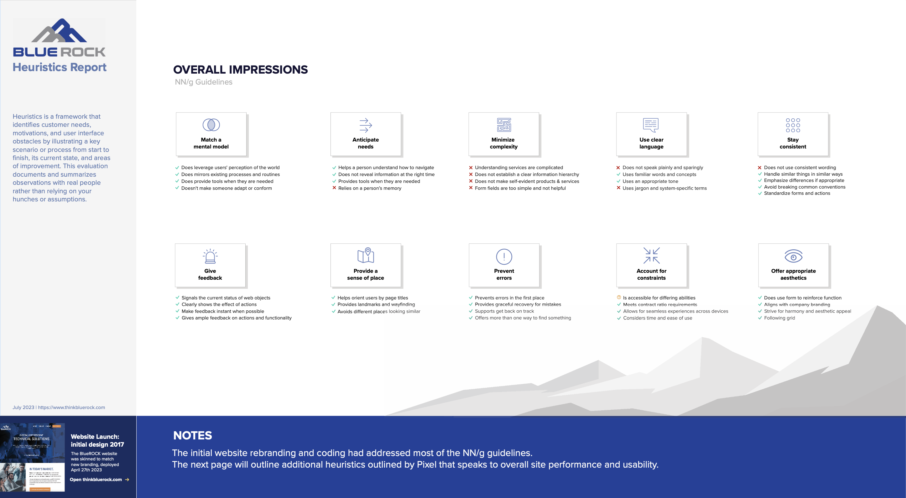
Click to view full Heuristics Evaluation PDF →
Website + CMS Modernization
Using the approved brand system, we redesigned and built a WordPress marketing site with a custom CMS. The IA and content were rebuilt to better express BlueROCK's services, differentiate offerings, and support lead generation through clearer navigation and more structured contact pathways.
Brand
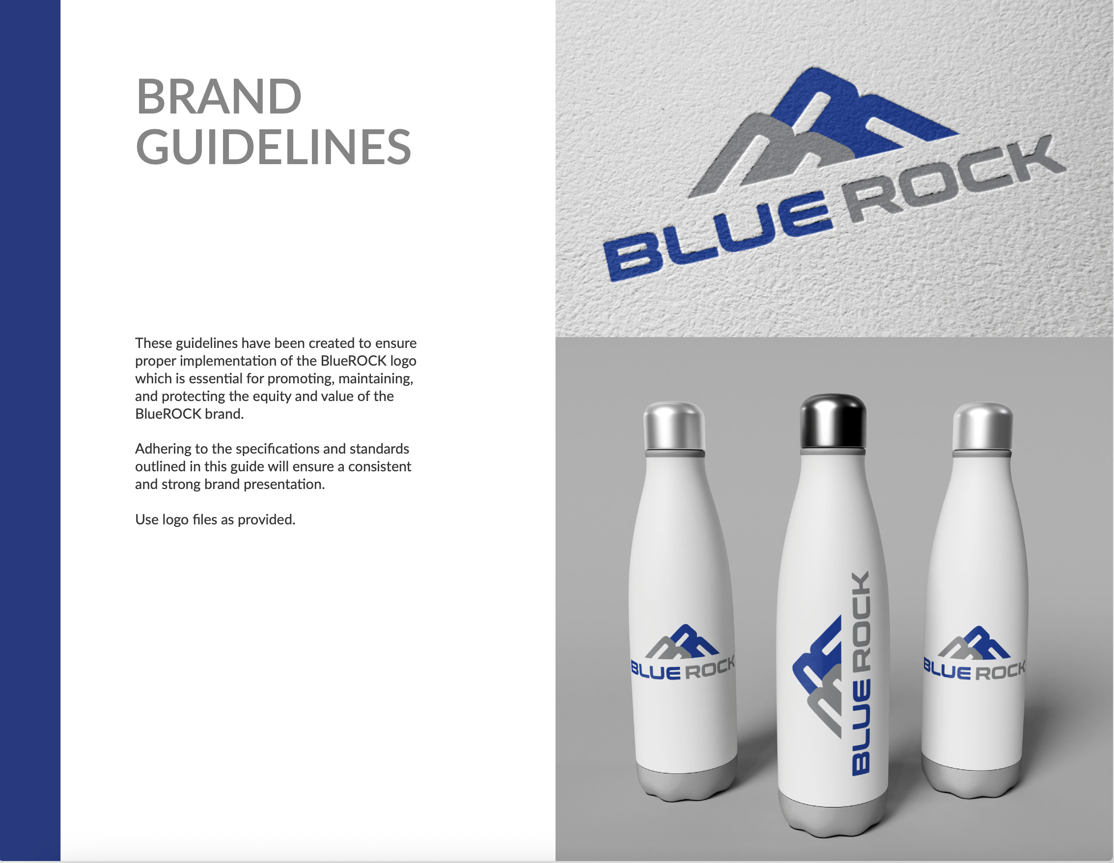
Brand Guidelines Overview
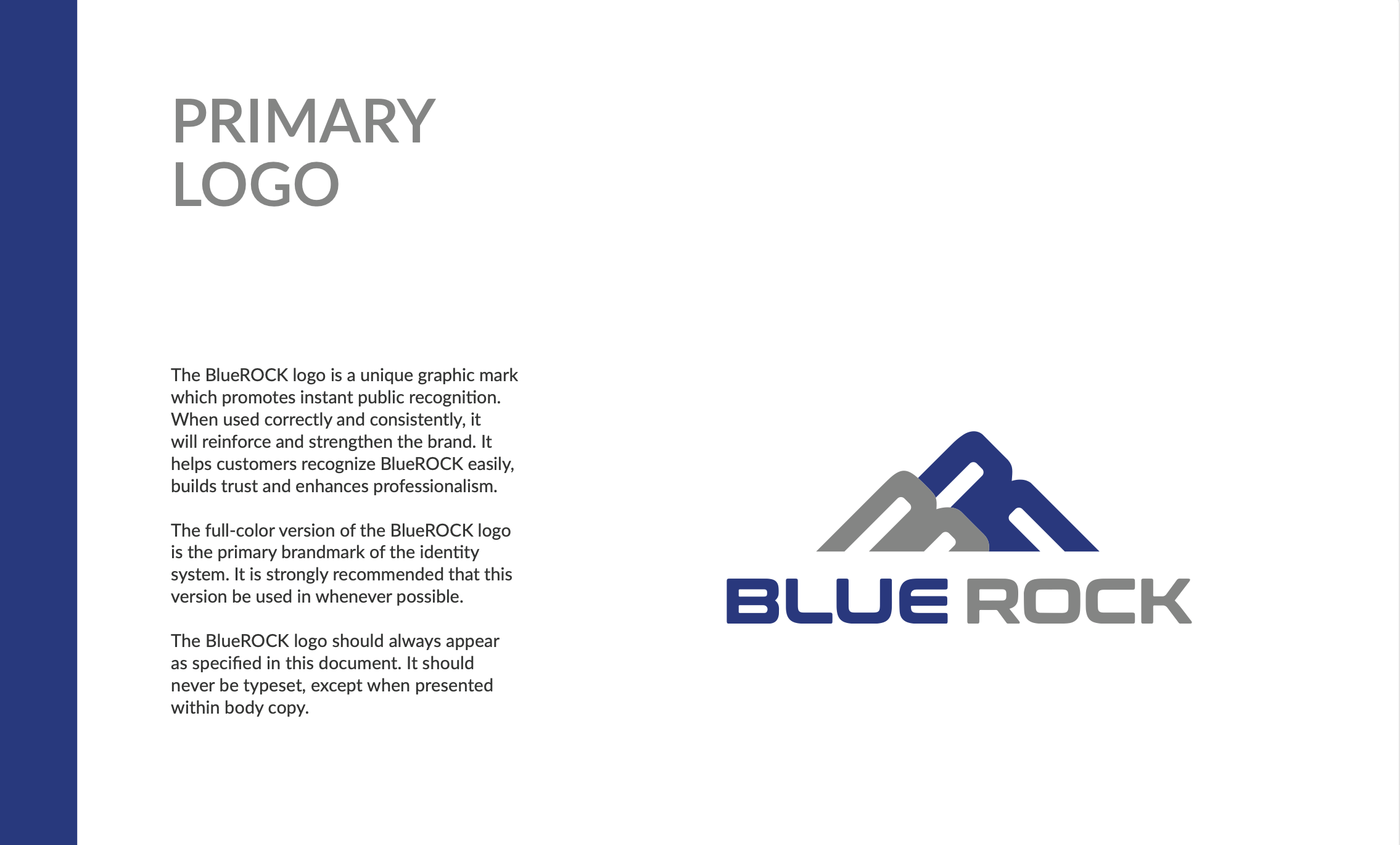
Primary Logo Design
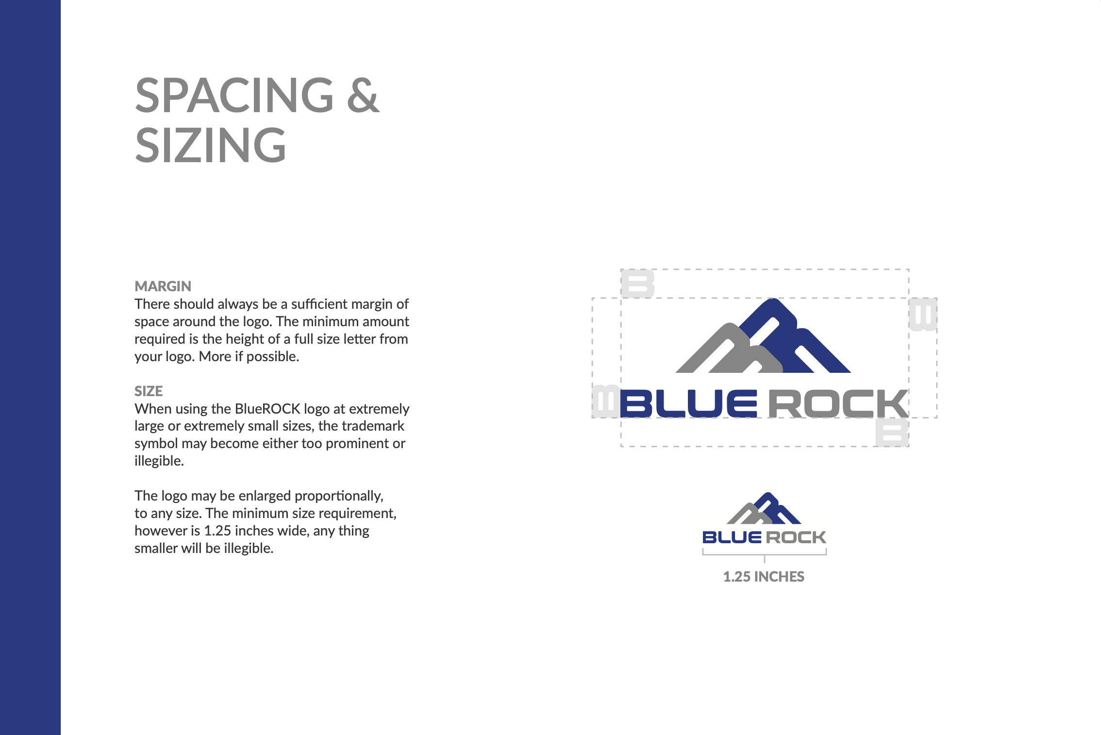
Logo Spacing & Sizing
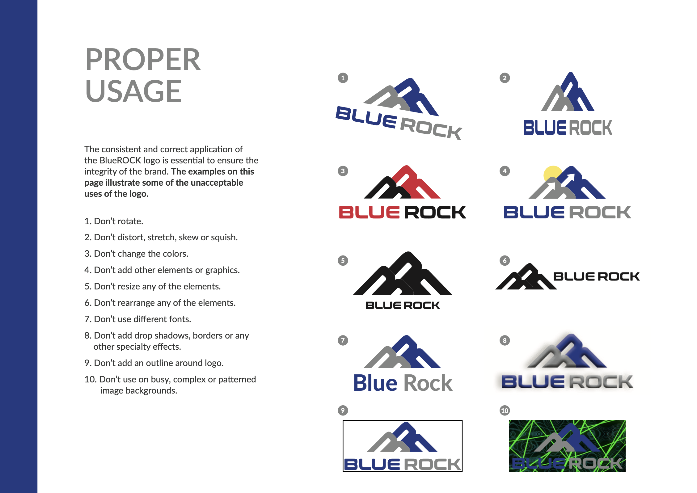
Proper Logo Usage
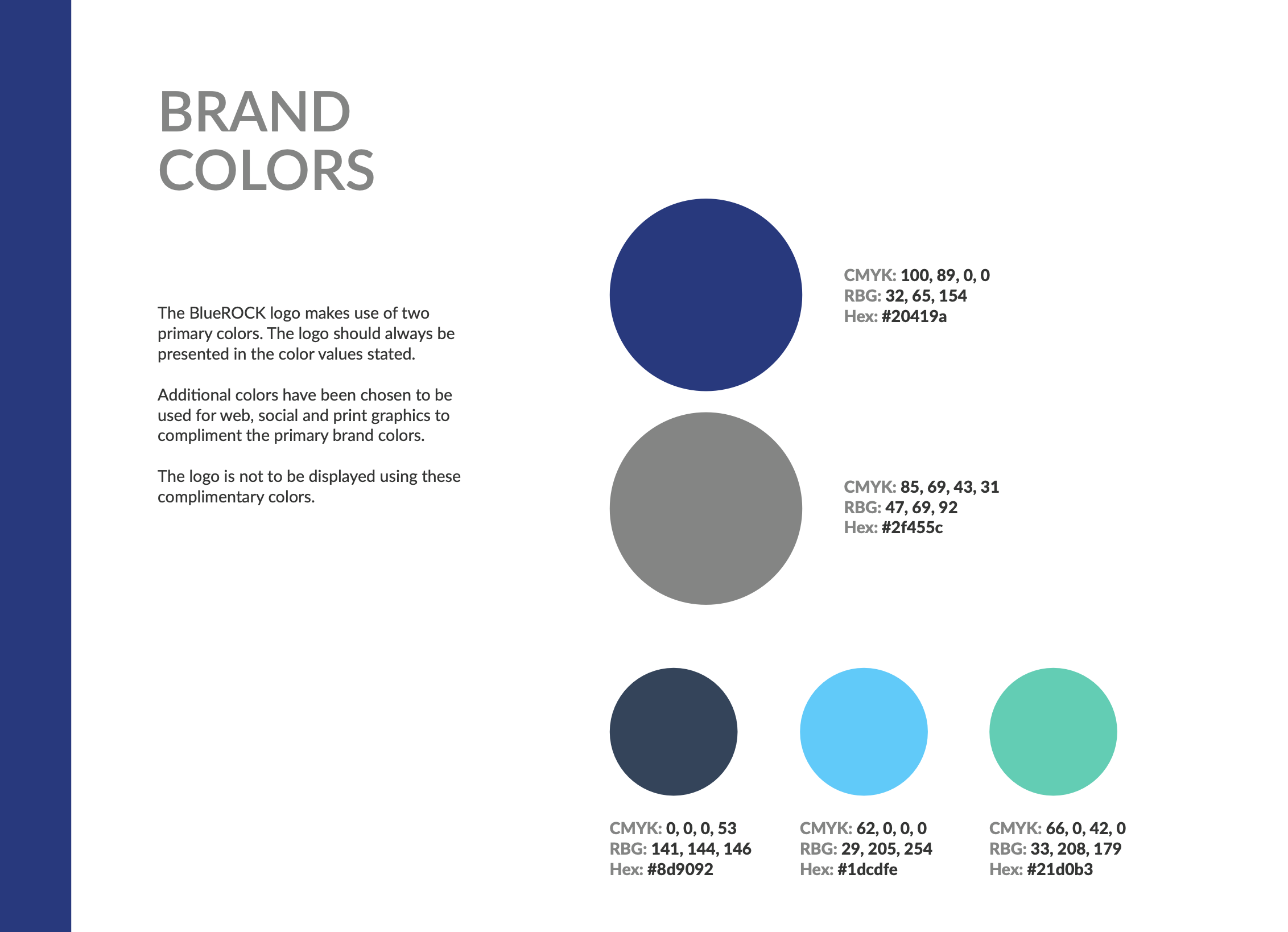
Brand Colors
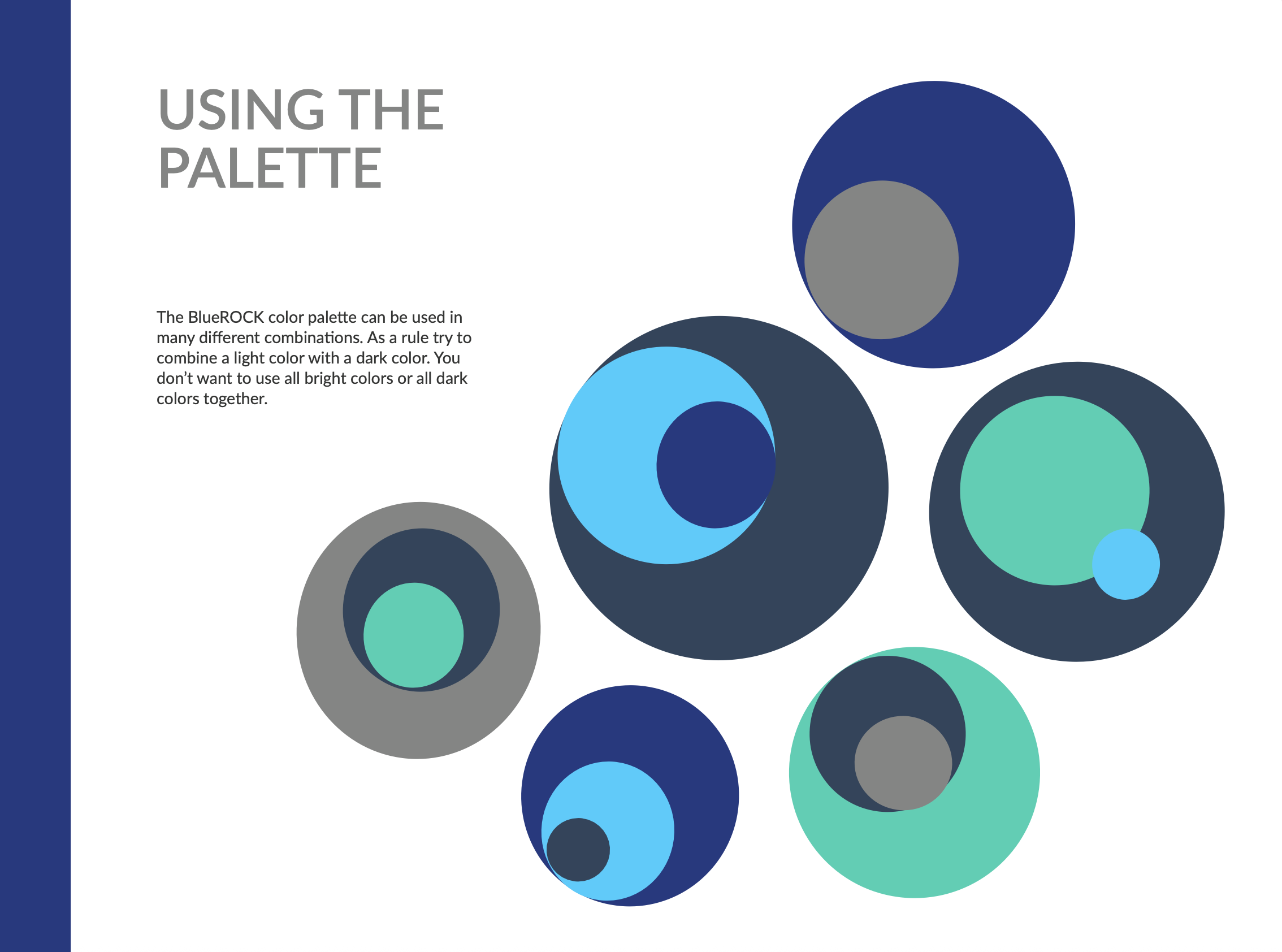
Color Palette Usage
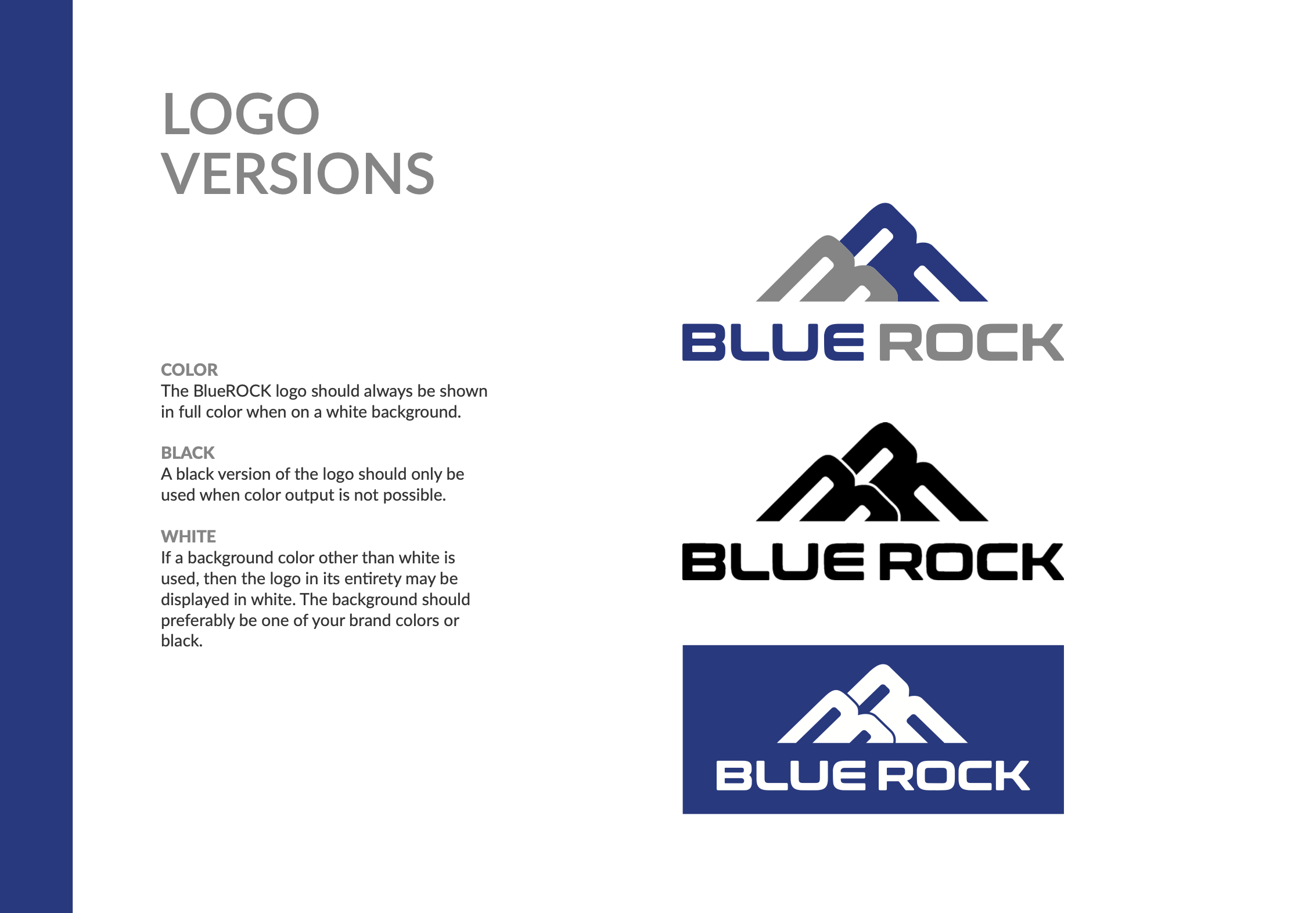
Logo Versions
Business Card Design
Deliver
- Delivered a complete rebrand: logo, color system, and brand guidelines to create consistency across touchpoints.
- Built a modern WordPress marketing site with a custom CMS to support ongoing content updates and service/page maintenance.
- Clarified service structure and messaging through collaborative content workshopping and iteration with stakeholders.
- Used a heuristic evaluation to identify UX and content hierarchy improvements (navigation clarity, services understanding, and contact form expectations).
- Established a scalable foundation for future marketing updates, service expansion, and content publishing.